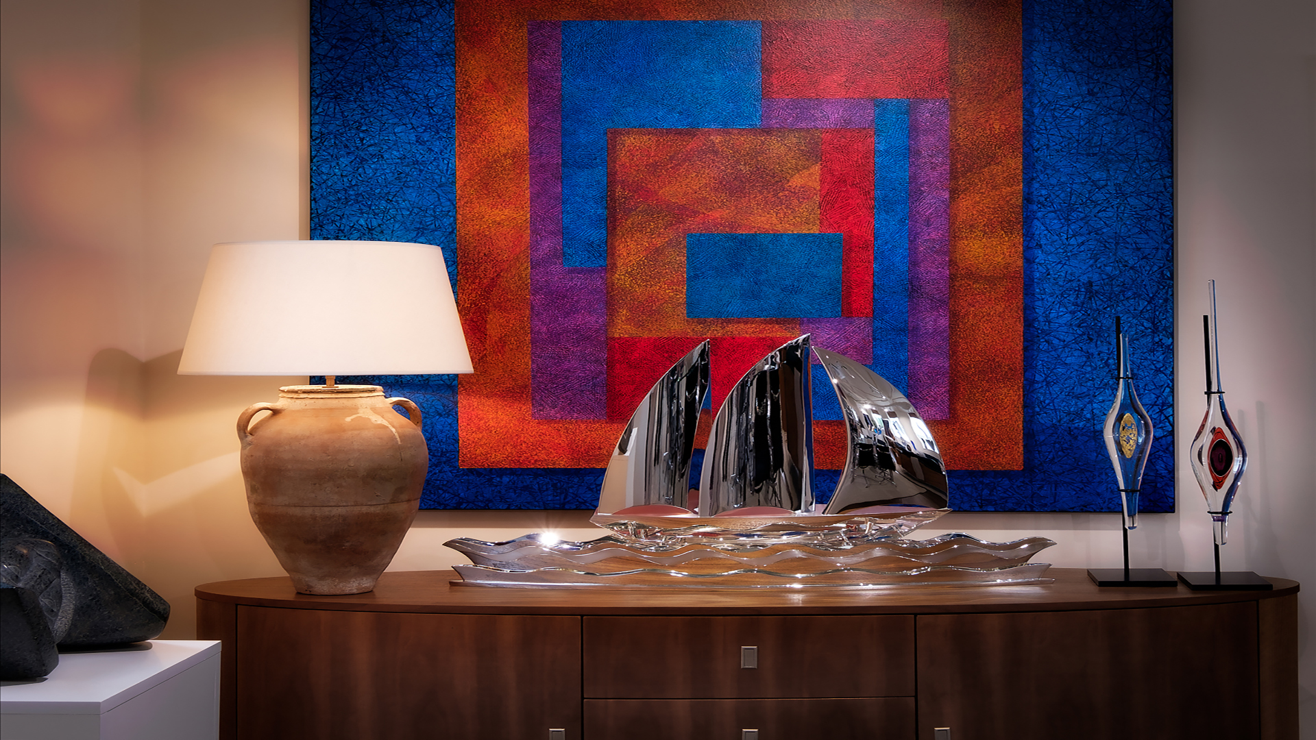
The psychology of color shapes emotions in design. Have you ever walked into a room and instantly felt at ease? Or maybe felt instantly uneasy and couldn’t quite work out why? It’s likely that colour had a lot to do with it.
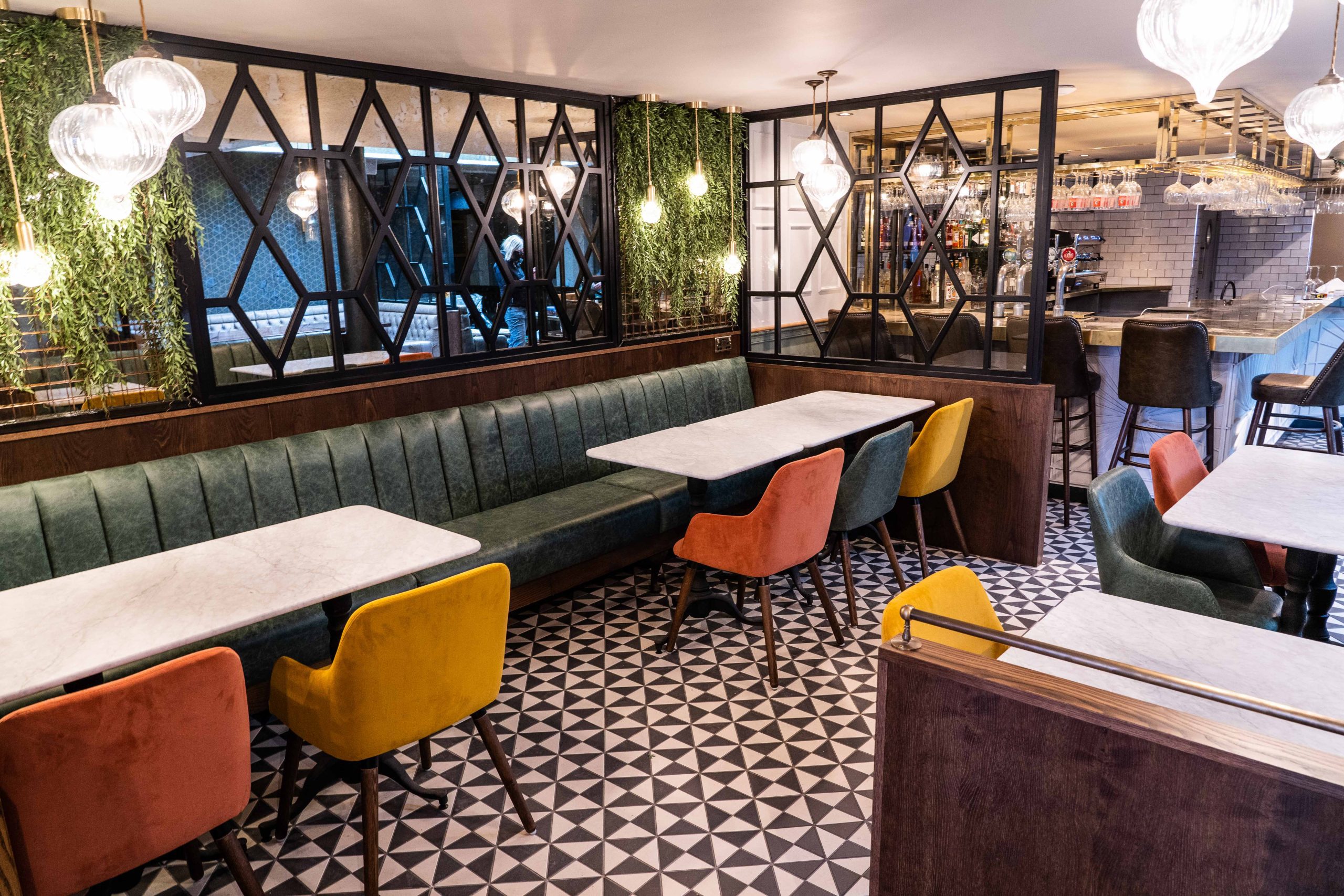
Color psychology (or colour psychology in the UK), sometimes known as color science, starts with understanding how different colours affect our emotions and behaviours. Whether we do it consciously or not, we automatically associate colours with specific feelings, influencing decisions like whether to stay in a space longer, feel comfortable enough to return, or even make a purchase. This is why your choice of colour should play an incredibly important role in interior refurbishment, especially in hospitality, retail, and commercial environments.
Think about the last time you walked into a café for the first time. Did it feel inviting or cold? It’s not just the colors on the walls that make that impact, though; every design element – from the furniture and décor to the flooring and lighting – will contribute to the overall atmosphere.
A well-thought-out interior refurbishment doesn’t just focus on making a space look good – it strategically makes use of colour to influence the client/employee’s mood and create a lasting impression. Whether it’s a retail store that’s built to encourage browsing, a hotel that feels like a home from home, or an office that keeps employees motivated, colour is one of the most underrated yet impactful design choices.
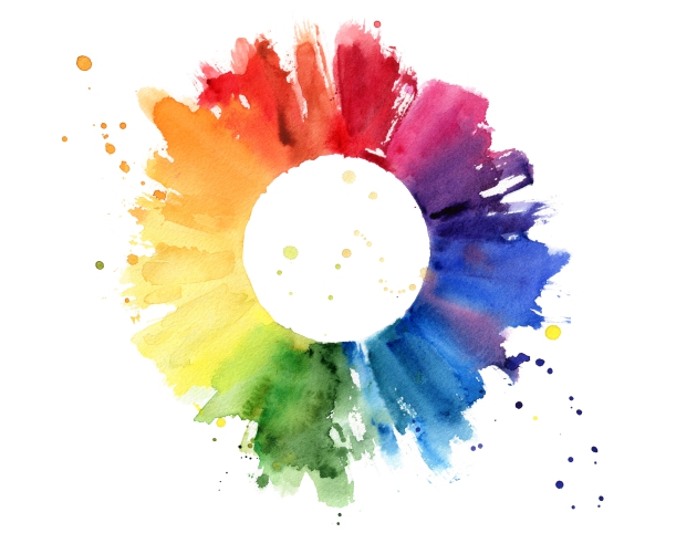
Colour theory is the foundation of how colours interact and how they make us feel, explaining why certain combinations work while others can make someone feel uneasy. Color Theory (for our American friends) is what helps designers create spaces that feel balanced, intentional, and engaging rather than mismatched or overwhelming.
At the heart of colour theory is the colour wheel. It looks simple at first glance but can be a very powerful tool to better understand how different colours relate to each other. The colour wheel breaks down colours into three main categories:
By understanding how these colours interact, design and production specialists can use them to set the right mood and influence how people experience a space.
Colour theory has evolved significantly over time, shaping how we understand and use colour in design, art, and science. The Smithsonian Libraries notes, “Aristotle developed the first known theory of color, suggesting that all colors came from white and black (lightness and darkness) and related them to the four elements – water, air, earth, and fire.” His ideas remained widely accepted for over 2,000 years until Sir Isaac Newton redefined colour as a property of light itself. In his 1704 collection Opticks, Newton’s famous prism experiment revealed the visible spectrum – red, orange, yellow, green, blue, indigo, and violet (ROYGBIV) – proving that white light is composed of multiple colours.
It was J.C. LeBlon who laid the groundwork for modern colour printing, however, by distinguishing between coloured light (as studied by Newton) and material colours (used by painters). His discoveries continue to influence everything from digital screens to print design, showing how colour theory bridges both science and creativity.

As mentioned earlier, the colour wheel may seem super simple at first but it’s actually one of the most useful tools in design and production. It helps designers and decorators work out which colours work well together and how to create the right balance (whether that’s through bold contrasts or seamless blends).
Some colours naturally complement each other, while others clash significantly. Getting the balance right can completely change the feel of a space. There are a few tried-and-tested colour schemes that designers use to create the right atmosphere, such as:
3. Warm Colours vs Cool Colors
Colours are generally split into two main groups, depending on the mood they create: warm colours and cool colours. The effect they have on a space is completely different, so anyone considering a refresh should consider:
A well-designed space doesn’t just rely on one or the other – balancing warm and cool tones can make a room feel inviting, productive, or even luxurious.

There’s a reason you’ll often see the colour blue in corporate offices, healthcare settings, and high-end retail stores – it naturally reduces stress and creates a sense of stability and trust. Blue is a colour that can instantly make a space feel calm, professional, and reliable. While cooler tones promote calm and tranquillity, a rich cobalt or navy blue can add a sense of depth and sophistication, making it a great choice for brands that want to project confidence and credibility.
Red is bold, intense, and impossible to ignore. According to ColorPyschology.org, it’s “the perfect example of a color that affect the marketing of food products. Its bright hue and association with high stimulation are used by many fast-food establishments to grab consumer attention.” But, because it’s such a powerful colour, it’s best used sparingly – think accents, feature walls, or statement pieces rather than full-room coverage.
Yellow is all about energy, positivity, and creativity; largely due to its automatic association with the sun. Because it sparks enthusiasm and encourages conversation, it’s often a great choice for cafés, retail spaces, and collaborative workplaces. A splash of bright, sunny yellow on a feature wall can instantly brighten a space, while muted shades like mustard or ochre add warmth without overwhelming the room. The key with yellow is balance – too much can feel overstimulating, but when used strategically, it can make a space feel vibrant and welcoming.
Green has a natural calming and refreshing effect, which is why it’s so closely linked to nature and well-being; it’s exactly why people often want to visit areas of natural beauty to unwind. Over the years, multiple studies have shown that spaces with green elements help reduce stress and improve concentration, which explains why modern offices, spas, and wellness centres have embraced biophilic design – incorporating indoor plants, natural materials, and soft green hues to create a more balanced, productive environment.
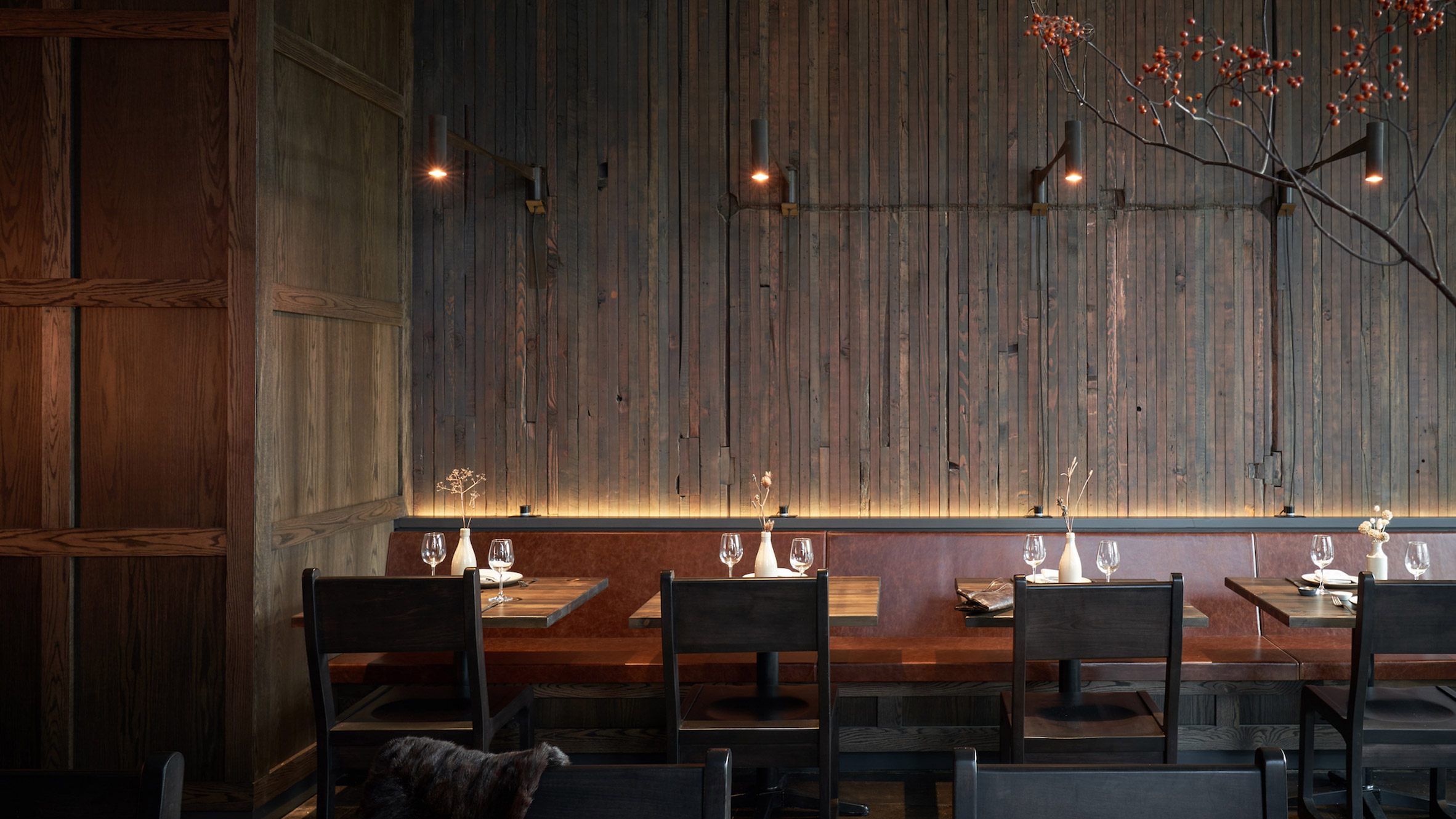
While bold colours can enhance a space, some shades should be used carefully:
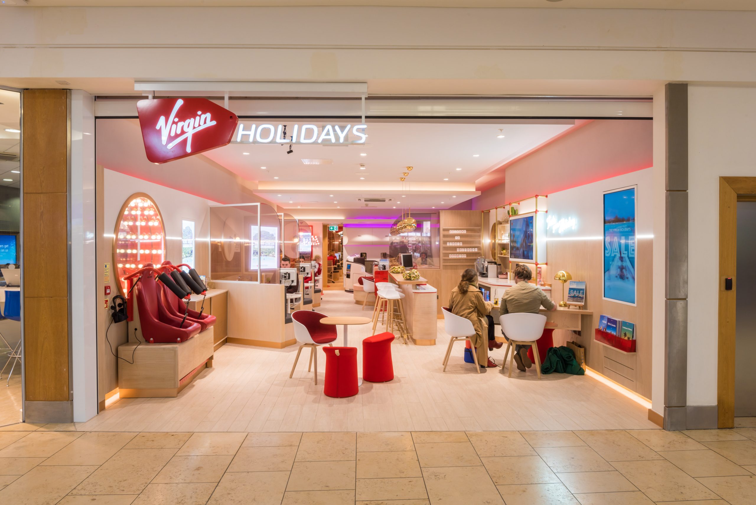
Choosing the right colour isn’t just about personal preference, it’s about creating an experience and achieving a goal. Before making any decisions, ask yourself:
The key is to use accent colours strategically to create focal points while ensuring they complement the larger design elements. For example, if you have a neutral base like soft grey walls, introducing deep blue in furniture or décor adds personality without overwhelming the space.
Well-planned interior refurbishments consider not just colour but also lighting, textures, and spatial flow to ensure a cohesive and inviting atmosphere.
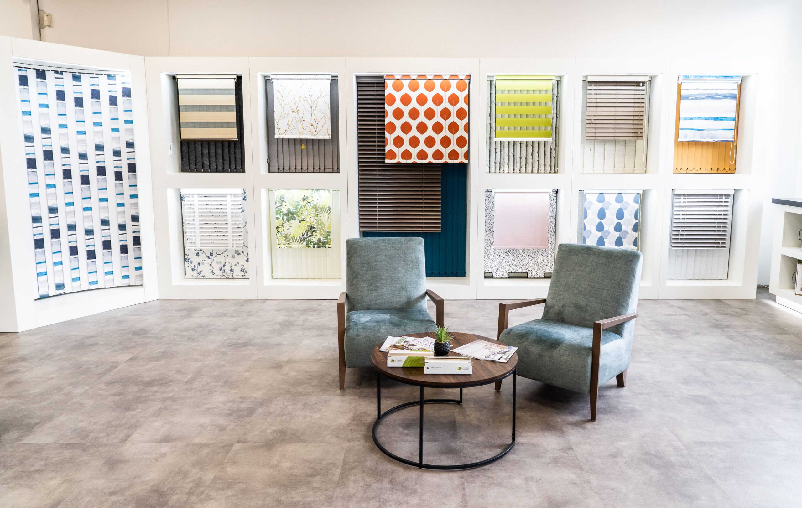
Colours affect mood differently. Some common reactions include:
Blue – Relaxed and focused.
Red – Energised and bold.
Green – Balanced and refreshed.
Yellow – Uplifted and creative.
Understanding these emotional effects helps create engaging, intentional spaces.
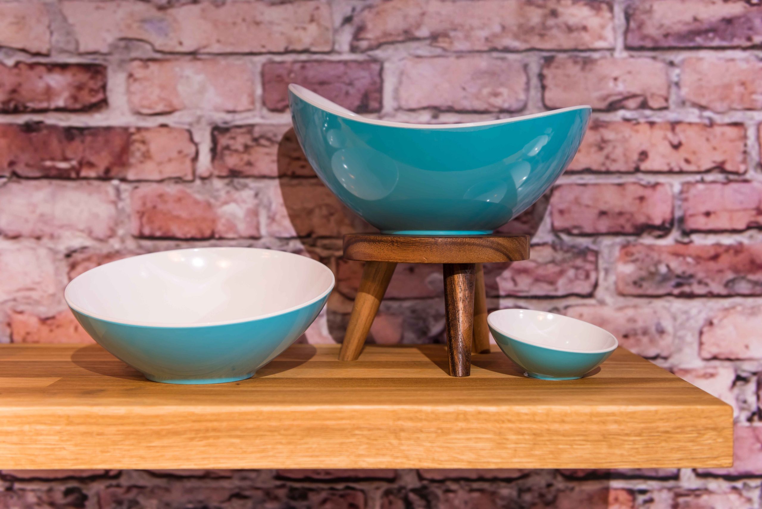
We understand the power of colour in design. Our team collaborates with you from concept to execution, ensuring your space reflects your brand while staying practical within budget constraints, materials, and spatial limitations.
Whether you’re planning a workspace renovation, retail refurbishment, or a hospitality fit-out, we help you make informed design choices that enhance customer experience and employee well-being.
A thoughtfully designed space isn’t just about aesthetics – it’s about functionality, brand perception, and emotional impact. With the right colours, you can shape an experience that people notice and keep returning to.
Allow Envisage to bring your vision to life. Get in touch today to create a space that blends design, psychology, and practicality.
Cool-toned LED lights (4000K-6500K) produce blue or cool hues, making a space feel modern and refreshing.
This is a complementary colour scheme, where high-contrast colours (red and green) create a bold, eye-catching effect.
The answer is saturation – as grey is added, the colour becomes muted and less intense.